6. QGIS#
A powerful desktop GIS software infinitely customizable with plugins
6.1. Background#
QGIS is a fantastic alternative to ArcGIS Pro, especially since it’s free, updated regularly, and has a supportive community surrounding it. It is a desktop package and has additional packages that come with it for download, such as GRASS GIS, which are worth checking out. QGIS is a challenging tutorial because there are so many resources available to learn how to use it. This chapter assumes you have downloaded QGIS and know how to use it. If you do not, see the Introduction to QGIS and Map Academy tutorials listed in the Resources section of this chapter.
6.1.1. Muringato case study#
QGIS is used IRL! See the dropdown case on land use change in Kenya using QGIS analytical tools conducted by scientists at the Remote Sensing Research Group, Institute of Geomatics, GIS and Remote Sensing, Dedan Kimathi University of Technology. This is an abridged version of the article and study.
Muringato Land Use Change Case Study
Monitoring the degradation of the Aberdare Ranges in the Muringato Catchment area, Kenya, Using Earth Observation Techniques
Authors: Simon Wachira Muthee, Martin Wainaina Chege, Bartholomew Thiong’o Kuria
TAKEAWAYS
The continued degradation of forest land within the Muringato basin, Kenya, is driven by anthropogenic factors such as deforestation, wetland conversion, climate change, and population growth.
The authors used Land Use Land Classification analysis to establish the climatic condition changes within the Muringato basin. The analysis was completed using QGIS software.
The study established the relationship between Land Use and Land Cover (LULC) changes and the climatic elements in the Muringato basin. Understanding the LULC dynamics amid changing climatic conditions can catalyze the community’s need for sustainable resource utilization.
Free and open-source geospatial tools were critical to this study because they provided a freely accessible platform supporting the manipulation of the data
INTRODUCTION
This study was undertaken in the Muringato basin, in the Upper Tana River Basin, Kenya (36.70 ° E –37.00 °E and 0.30 ° S –0.45 ° S). The basin covers an area of approximately 225 km2. The continued degradation of the forest land within the basin has been greatly influenced by anthropogenic factors, key among them being deforestation and conversion of wetlands into agricultural land (Muringato WRUA, 2014). This research, therefore, aimed at characterizing the changes in part of the Aberdare forest cover from 1990 to 2020.
METHODS
Land Use Land Classification analysis was undertaken to establish the changes in climatic conditions within the Muringato basin. This was achieved through a time series analysis of Landsat 4, 5, 7, and 8 satellite Imagery acquired between 1990 and 2020 (Liu et al., 2009). The imagery was pre-processed, and a LULC classification was performed using the Support Vector Machine Classifier. This classifier was preferred since it works well with even and uneven structured data (Rudrapal et al., 2015). Please see the Muringato Appendix for a more detailed workflow.
RESULTS
Forest cover comprised 121 km2 of the Muringato catchment area in 1990 Fig. 6.1. This decreased to 90 km2 in 2000, signifying a 25% reduction in forest cover. The forest cover in 2010 was 85 km2, a 29% reduction compared to 1990. In 2020, the forest cover was 80 km2. This was a 33% reduction to 1990. The reduction in forest land was attributed to the conversion into range and built-up lands. The overall classification accuracies for the images ranged from 79.06% to 89.09%, and the kappa coefficient ranged from 72.32 -85.73. The analysis of climate elements revealed that the average climatic changes in the basin rose 1.36°C and 0.94°C in max and min temperature, respectively.
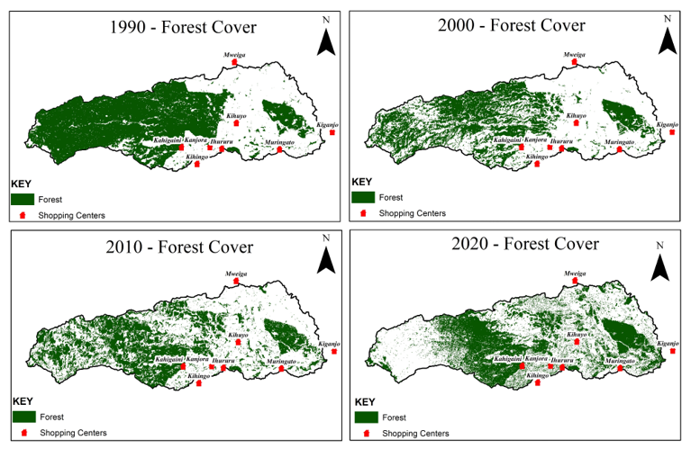
Fig. 6.1 Muringato Land Use and Land Cover time series analysis from image scenes.#
6.2. Sierra species richness#
For this tutorial, we’ll examine species richness by hexagon, known as tessellation, in the Sierra Nevada, California. Ensure you regularly save the project by typing control/command S or Project/Save.
6.2.1. Workflow#
We will follow the following workflow to examine species richness:
Add data
Style layers
Create and clip grid: Processing toolbox
Run summary statistics and style
Create a layout or export to the web
6.2.2. Add data#
If you haven’t already installed the QuickMapServices plugin, go to Plugins/Not installed, look for QuickMapServices, and select Install Plugin. In QMS, search for Dark Matter and click Add to add it as a basemap.
Go to the Biodiviersity Conservation dataset for the California Wildfire Task Force Regional Resource Kits. Under Species Diversity/Wildlife Species Richness, click the pull-down menu for Raw Data, download, then unzip the tif file.
Add your downloads folder to favorites in the browser panel by navigating to your downloads, right-clicking, and selecting add to favorites. In the favorites at the top of the panel, open downloads, the species richness file, then draft the tif onto the map canvas. It should appear on the map and in your layers (Fig. 6.2).
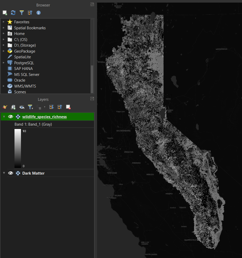
Fig. 6.2 Grayscale raster of wildlife species richness imported into QGIS.#
Let’s change the gray color of the raster to something easier to view. Click on the Open Layer Styling panel in the upper left corner (or F7) in the layers panel. The wildlife species richness layer will become active after you click it (Fig. 6.3).
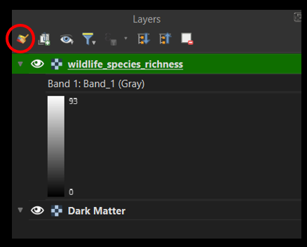
Fig. 6.3 QGIS Layers panel.#
This opens the styling panel. Underneath the layer name, click the Singleband gray to Singleband pseudocolor. Then select magma—when you’re selecting magma, say MAGMA to yourself in a mysterious, authoritarian Dr. Evil voice. Fig. 6.4 is the resulting change in the raster.
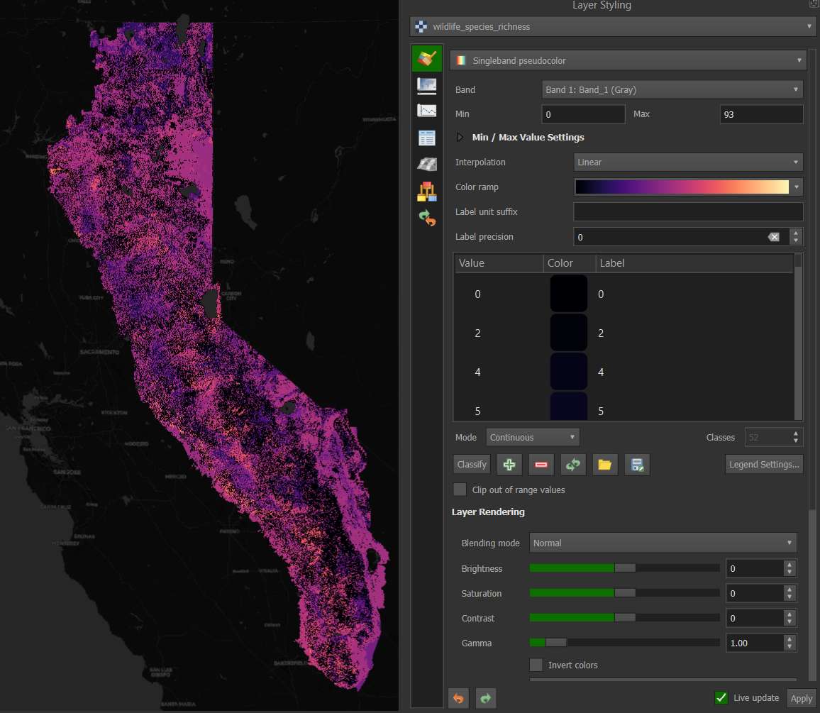
Fig. 6.4 Changing the raster to a magma color ramp using the Layer Styling panel.#
Close the layer styling panel and return to the browser, where the ArcGIS Rest Server is located. Right-click and select New Connection. Under the name, enter Task Force Regions, and enter this url. Click ok to activate (Fig. 6.5).
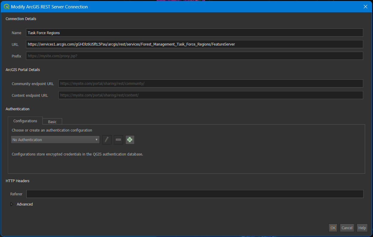
Fig. 6.5 Adding the Task Force Regions using the ArcGIS REST server connection.#
The url comes from the ArcGIS online metadata page for Forest Management Task Force Regions. On the page, you will see a url and a copy sign. If you get to the Map Viewer instead of the metadata, click on Information and then the paper arrow icon to get to the page to copy the REST server url (Fig. 6.6).
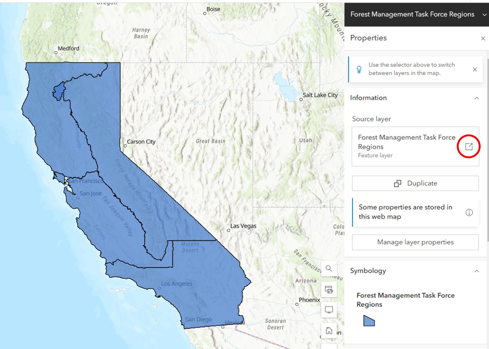
Fig. 6.6 ArcGIS online view of the Wildfire and Forest Resilience Task Force Regions.#
For some reason, some links to REST servers do not work at all or do not work the first time you create the connection. If this happens, it is worth trying to delete and add the server again.
6.2.3. Style layers#
Now that the Task Force REgions have been added click the arrow to the left of the new connection and drag the vector layer onto the map window or down to the layers panel. Turn off the species richness raster layer by clicking the eye to the left of the layer name in the layers panel. The task force regions should show up with a random color and outline in black. When added, the layer should be selected, so click on the Open the Layer Styling Panel icon in the upper left of the layer panel (or F7) to re-open the symbology or styling panel (Fig. 6.7).
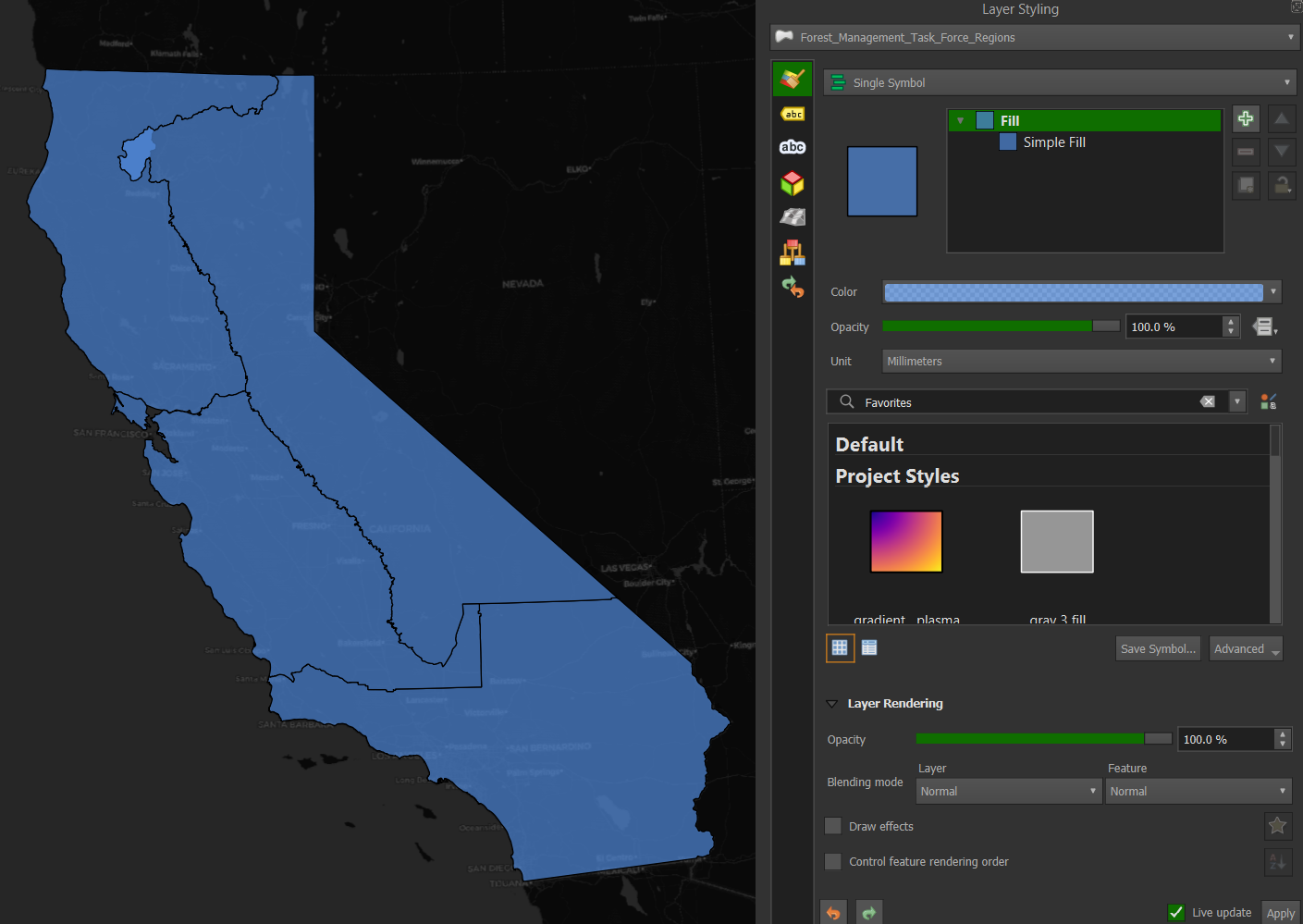
Fig. 6.7 Opening the Layer Styling panel with the Task Force Regions selected.#
Under Single Symbol, click Simple Fill under Fill. Click the arrow next to the fill color and select the box for Transparent Fill. You can also play around with the colors to see how they change. In the lower right of the Layer Styling box, the box for Live updates should be checked, and the changes are instantaneous. When you click the Transparent Fill, the layer will seem to disappear since the basemap is black. Never fear, it’s still there. Click the arrow next to Stroke Color, and under Standard colors, select white, and the regions will appear in white (Fig. 6.8).
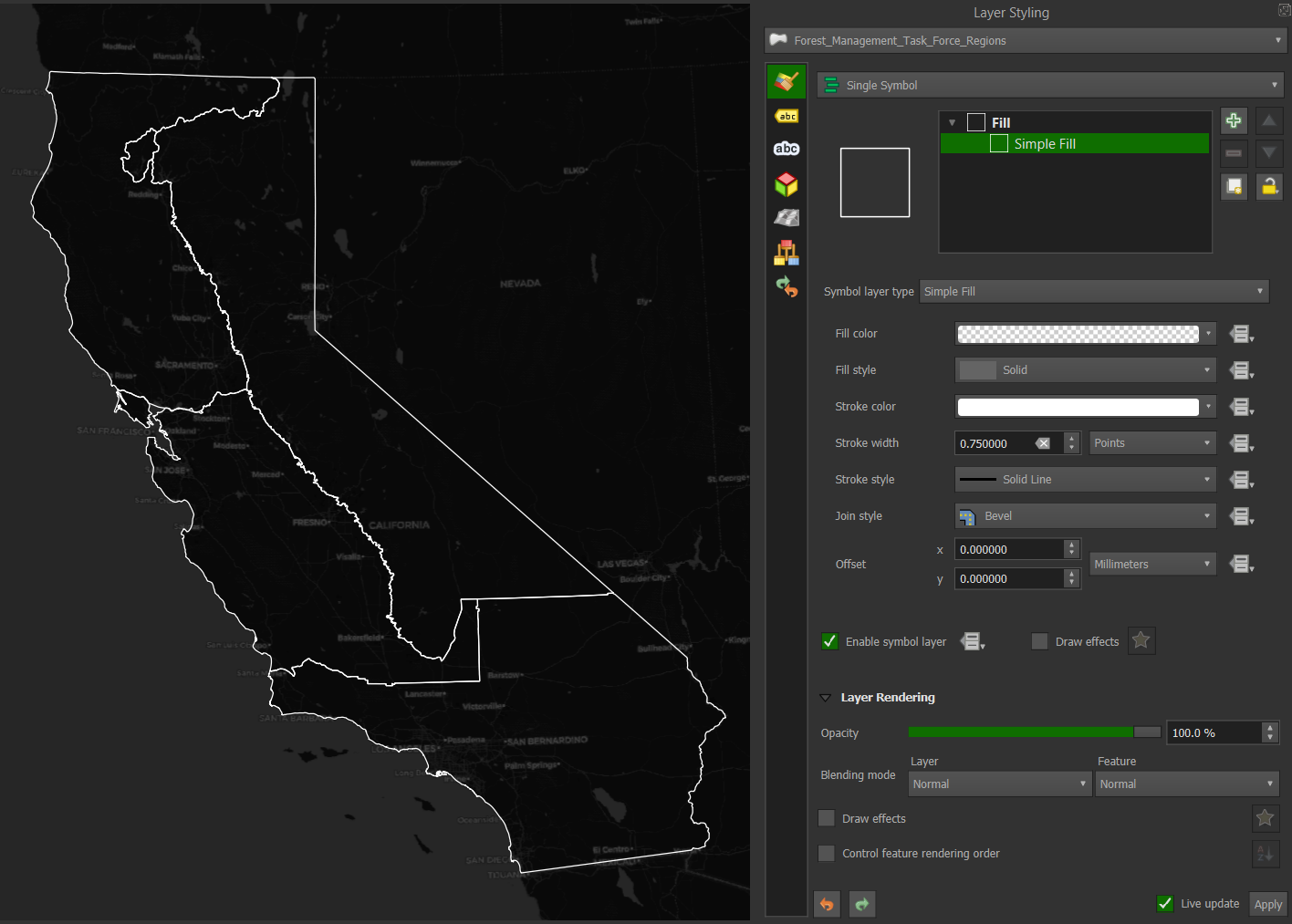
Fig. 6.8 Changing the Regions to white border no fill using the Layer Styling panel.#
6.2.4. Processing toolboxes#
Head back to the Layers panel, right-click the Task Force Regions layer, and select Filter. We will filter the vector layer to only show the Sierra Nevada and Cascade Region. This will bring up the Query Builder window:
Double-click Region in the Fields box on the upper left. “Region” will appear in the Expression box below.
Click the = sign in the operators box above the Expression box.
In the upper right Values box, click on Sample, bringing up the possible names
Double click Sierra - Cascade - Inyo
‘Sierra - Cascade - Inyo’ will appear in the Expression window below.
To ensure the expression is valid, click test, and the Query Result will say the where clause returned 1 row. Congratulations, you just completed a data query with the clause returning 1 row (Fig. 6.9).
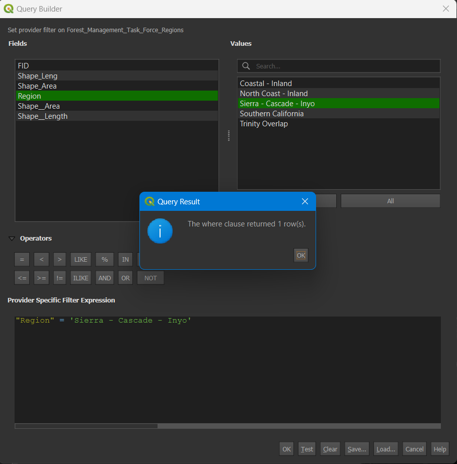
Fig. 6.9 Using the Query Builder to select the Sierra-Cascade-Inyo region.#
Click OK to complete the query and close the box. Now, only the Sierra Nevada region will show. Right-click the layer in the Layers panel, select properties, and rename the layer to Sierra Nevada in the open window.
At the top of the QGIS window, below the Project, Edit, and View windows, there is an Attribute Toolbar (Fig. 6.10)

Fig. 6.10 Toolbar showing the attributes icon (red circle).#
Click on the cog icon to open the Processing Toolbox. If you left the Layers Styling panel open, close it to maximize the Toolbox pane. In the search panel, type grid, and double-click on Create Grid to open the grid tool (Fig. 6.11).
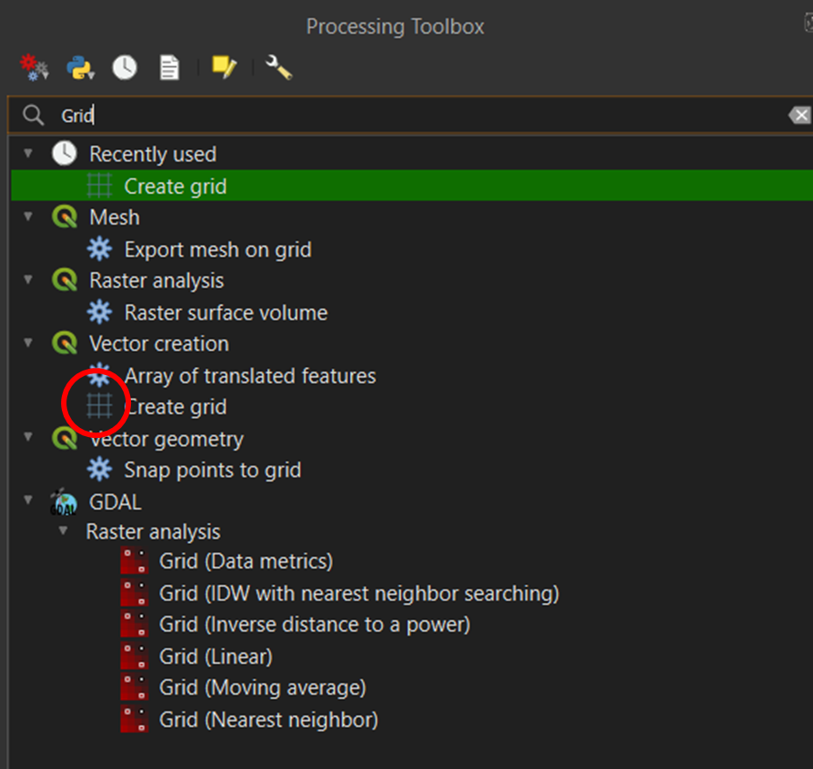
Fig. 6.11 Toolbar showing the attributes icon (red circle).#
Fill out the tool with the following parameters (Fig. 6.12):
Grid type: Hexagon
Grid extent: Click the arrow, select Calculate from Layer, and select Sierra Nevada
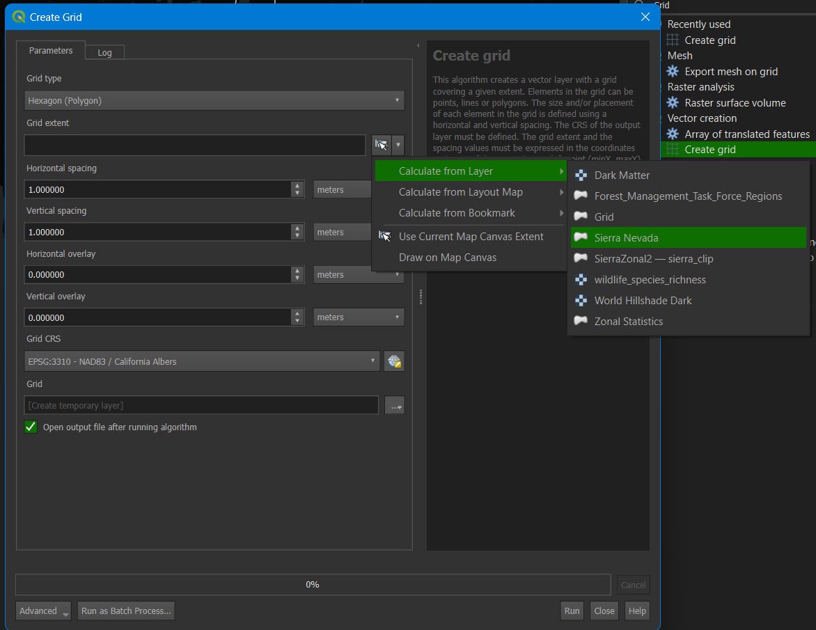
Fig. 6.12 Create Grid tool parameters showing Calculate from Layers/Sierra Nevada selected.#
For horizontal and Vertical spacing, enter 10000 meters. If you see degrees as the option, change the CRS projection to EPSG:3310 NAD83/California Albers. You may need to change the QGIS settings to default to this projection, which can be tricky.
Click run. It should take a short time to create, and a tessellated grid of hexagons will appear over the Sierra Nevada region. Then, close the tool window and the processing toolbox.
Open the Layer Styling Pane>Simple Fill>Fill color>Transparent>Stroke Color>Light Blue. Make sure to click on the light blue in the circle, and within the triangle, click on the corner of the triangle for the color (Fig. 6.13).
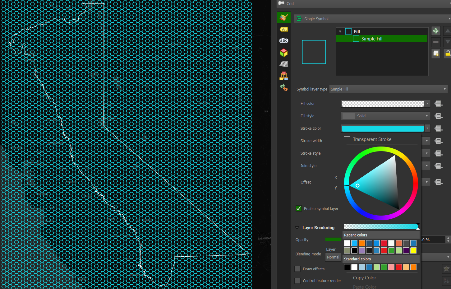
Fig. 6.13 Tessellated hexagon grid covering the map extent.#
We need to clip the hexagons outside the Sierra region. Close the Layer Styling Pane and open the Processing Toolbox. Start typing Select by location and double-click the toolbox with the same name. Fill out the toolbox with Select features from Grid, where the features Intersect, and compare to features from Sierra Nevada (Fig. 9.2).
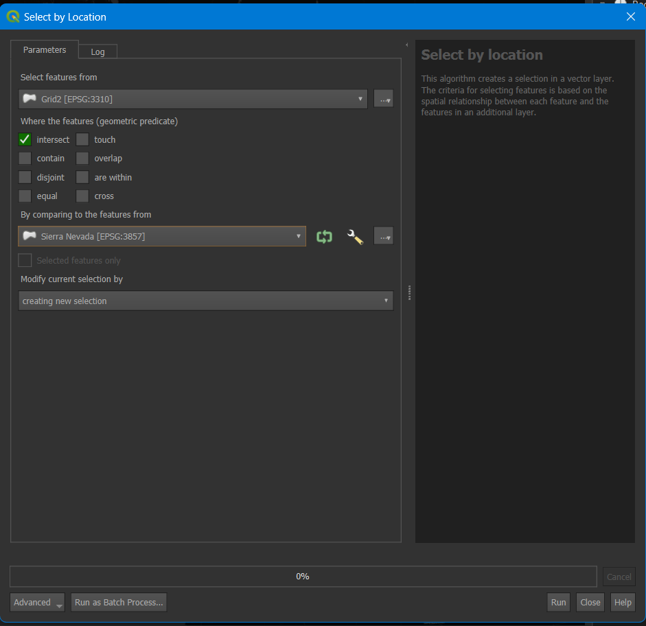
Fig. 6.14 Select by Location tool.#
Click run, resulting in a hex grid for the Sierra region (Fig. 6.15).
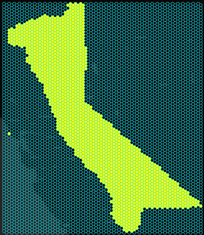
Fig. 6.15 Selected Sierra region for the tessellated hex grid.#
Right-click the grid layer>Export>Save Selected Features As (Fig. 6.16). The screenshot shows that I have a copy of the grid layer that appears below the selected layer. Please ignore this.
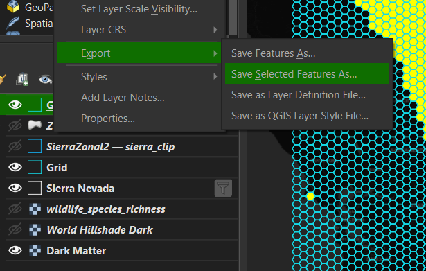
Fig. 6.16 Export/Save Selected Features As.#
In the save dialog box, enter Format: Geopackage, File Name Sierra Clip (click the three dots to the right and navigate to the folder where you’ve saved the project), Layer name: Sierra Clip, and click ok. You should get a Layer Export success message at the top of the map window.
Note
That’s a lot of work to create hex layers; they’re not even transverse hexagons! You can create hexbins at the click of a button using the kepler.gl open app that can be used within VS Code or in a jupyter notebook.
6.2.5. Attribute table edit#
You may notice a polygon to the west in Marin County covering some of Point Reyes National Seashore near Drake’s Estero that appears as a solo hexagon (Fig. 6.16). This seems to be an error in the vector layer from the Task Force. Let’s delete it so it doesn’t appear in the subsequent analysis.
Zoom into the polygon by pressing the + icon in the attribute toolbar and using the hand to the left to pan to the location (hover over the icons to get the icon’s name). In the same toolbar, click on the info circle with the arrow. The Identify Features icon is useful for clicking on any map area to show the layers and information about the pixel you’ve clicked. Once you’ve selected Identify Features, click inside the polygon on the map.
The polygon will change color to show it’s selected, and an Identify Results box will open (Fig. 6.17).
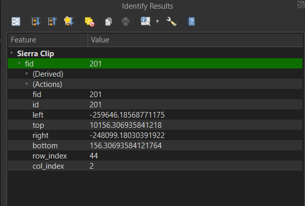
Fig. 6.17 Finding the value of the errant hexagon using Identify Results.#
Values from the attribute table will appear, showing the fid, id, polygon values, and row and column indices. Note that the fid and id numbers are 201. Close that pane and click the Open Attribute Table (F6) to the right of the Toolbox icon on the attribute toolbar, which looks like a table. Click the Sierra Clip layer to ensure it is selected in the Layers panel before clicking the Attribute Table icon.
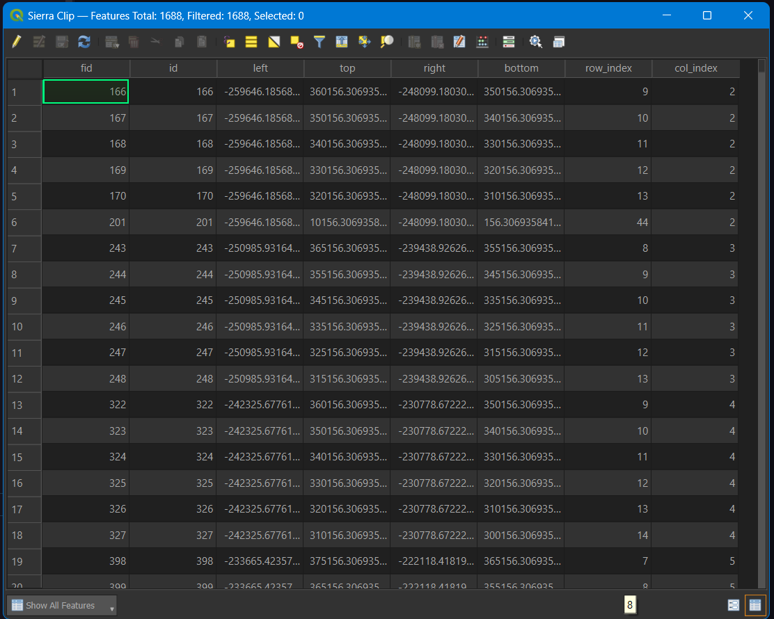
Fig. 6.18 Sierra Clip attribute table.#
In the attribute table, you will see the different fields for the layer (Fig. 6.18). This is a simple table since it is a series of polygons. Try selecting other layers in your project to see how each attribute table differs. However, since it is a raster layer, the species richness layer will not have an attribute. If you click the Identify Features, the species richness layer will show values stored by pixel in the raster. Opening attribute tables is often the best way to understand the data you are analyzing.
Click on the pencil icon at the top left of the layer to activate editing mode (Fig. 6.19). Then, select the 201 fid/id row by clicking on the row number to the left. It should be row 6.
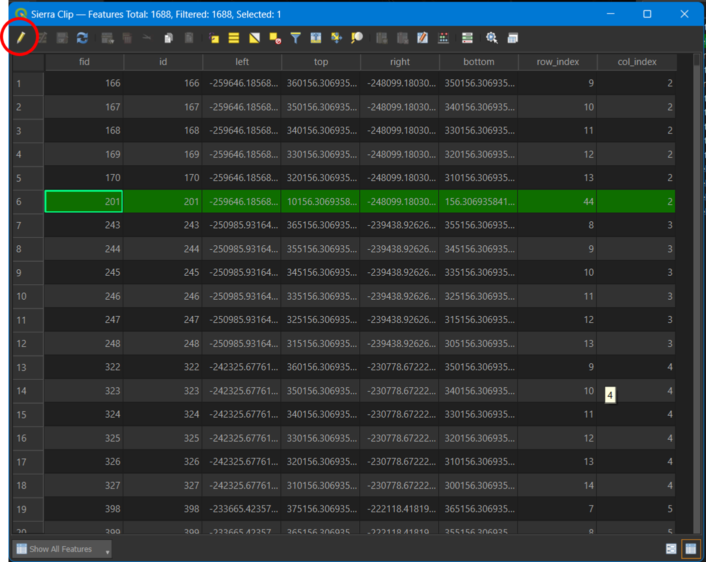
Fig. 6.19 Clicking the pencil (red circle) to enable edit mode in the attribute table.#
Click the delete button on your keyboard, de-select the pencil editor, accept save changes, and close the attribute table. You’ll notice the Marin hexagon is gone.
6.2.6. Summary statistics#
Zoom back to Sierra Clip by right-clicking the layer and selecting Zoom to layer(s). This will center the Sierra Clip layer. Select the Sierra Clip layer by left-clicking it. Open the Toolbox and start typing Zonal, then select Zonal Statistics and make the following changes:
Input layer: leave as Sierra Clip.
Raster layer: click the arrow and select wildlife species richness.
Statistics to calculate: click the three dot box to the right and make sure Count, Sum, Mean, and Maximum are checked.
Click the blue arrow in the upper right to go back, and then click run.
Depending on your computer speed, The process may take ~ one minute to run. Close the Zonal Stats tool when completed.
A new Zonal Statistics layer will appear in your layers with a scratch box to the right. Click the box to save the scratch layer:
File name: navigate to your project folder and save it as Richness Stats.
Layer name: Richness Stats and click ok.
You should get a ‘layer saved’ success notification at the top of the map, and the gray scratch layer box disappears from the layer panel.
To change the name in the Layer panel, you may need to right-click on the layer and re-name it.
Close the processing toolbox, and with the layer selected, open the Layer Styling pane:
Change Single Symbol to Graduated.
Click the arrow next to Value and scroll down to select _mean.
Towards the bottom of the panel, click the classify button and turn off the Sierra Clip and Sierra Nevada layers in the layers panel (Fig. 6.20)
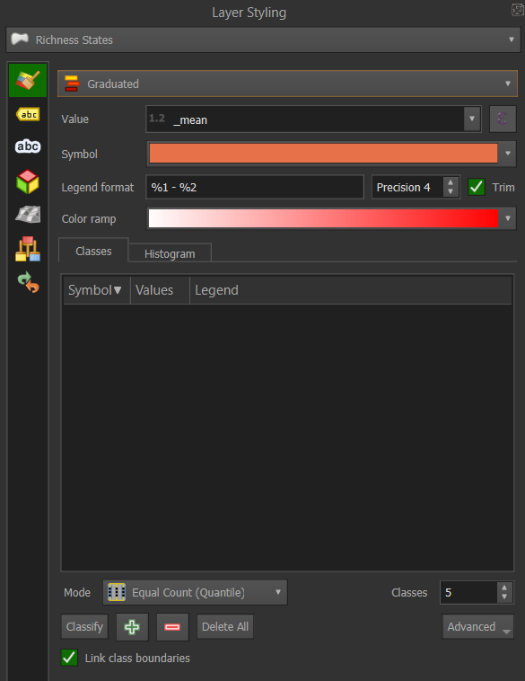
Fig. 6.20 Layer Styling panel. The Classify button is in the lower left next to the green plus and red minus signs.#
Click on the color ramp and change to Viridis (or if you’re feeling the Dr. Evil thing, select Magma!). Your map should look like Fig. 6.21.
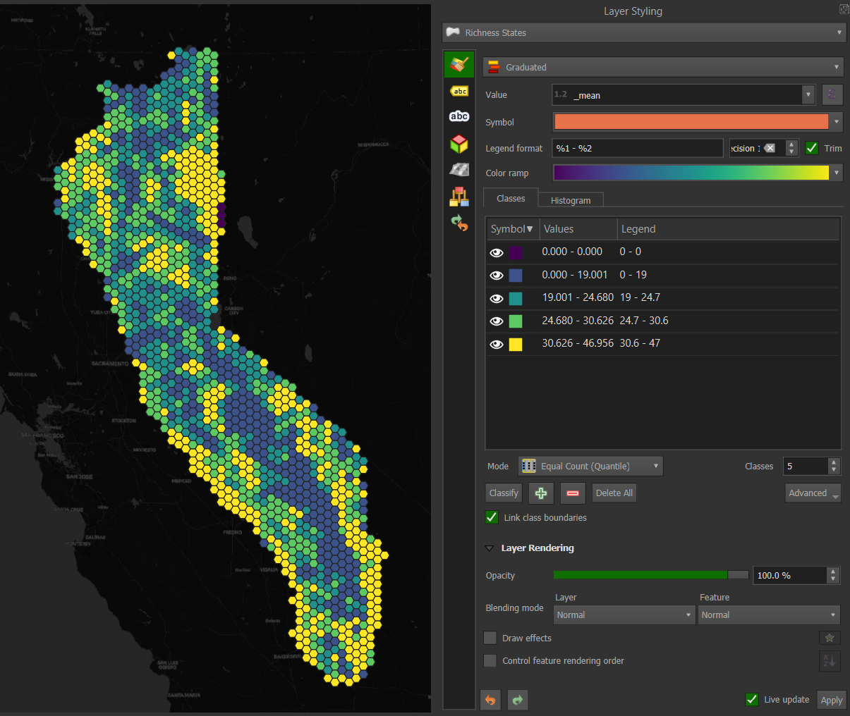
Fig. 6.21 Selecting the viridis Color ramp in the Layer Styling panel.#
Change the number of classes by clicking the arrows next to Classes below the Symbol/Values/Legend box. To change the type of classification, click next to the Mode button. The default is Equal Count (Quantile), but Natural Breaks (Jenks) or Standard Deviation are often used depending on the data and how you intend to portray it. Try these out with different numbers of classes and see how the map changes. Don’t forget to type Save S or Project/Save. Also, check out what happens when you select a different field Value.
In this map, you’ll notice that higher species richness is aggregated by hexagons in the foothill regions on either side of Sierra Nevada, and the lowest richness is at higher elevations. In the Styling panel under Rendering, you can use the slider to decrease the opacity and look underneath the layer. It might be interesting to import a hillshade layer to understand better where each hexagon lies or a lighter OSM basemap to see more reference cities and geography.
Return to QMS, type hillshade in the search function, and add the ESRI world hillshade. With Richness Stats selected, open the Styling pane and try different selections for the Layer blending mode. Multiply and Hard Light appear to be the best. If the layer disappears, you may need to click on Classify to re-classify.
6.2.7. Layout/webmap#
We won’t go into depth to create a layout for exporting your map. The steps are as follows:
Go to the Project menu and select New Print Layout.
Enter a name for the new layout and click OK.
A new window will open with a blank layout.
Go to the Layout menu and select Add Map. Click and drag the map onto the layout where you want it to be.
Adjust the scale and position of the map in the layout using the Item Properties panel.
To add other elements, such as a title, legend, scale bar, north arrow, etc., use the Add menu on the left side of the layout window.
Once you are satisfied with your layout, use the Layout menu to export it as an image, PDF, or SVG.
Instead of a static layout, you may want to export it as a web map:
Go to the Plugins menu and select Manage and Install Plugins.
Search for qgis2web and click Install Plugin.
Go to the Web menu, select qgis2web, and Create a web map.
Select OpenLayers as the format.
Adjust any other settings as needed.
Click Export to export the project as an OpenLayers map.
The project should open as an html file in your default browser.
6.3. Resources#
The Sierra species richness tutorial should give you a flavor of QGIS’ capabilities and processing algorithms. To go deeper in your learning and geospatial practice, here are some additional QGIS resources:
QGIS Training Manual. A comprehensive resource for all use cases of QGIS, plus contributed chapters and tutorials. Always a great place to search to find specific answers to your problems.
Spatial Thoughts. Free or paid options are available with comprehensive Introduction to QGIS, Advanced QGIS, or Spatial Data Visualization with QGIS. The course materials and tutorials are free and have clear instructions and figures to follow each tutorial.
Map Academy. Everything you need to know about QGIS, usually in short, digestible snippets. It also includes excellent videos on Aerialod, a path-tracing map visualizer using DEMs, and other data.
Hans Van der Kwast. It is particularly good for QGIS hydrological applications but also has Lidar, image analysis, and raster analysis.
Burd GIS. Many practical videos on QGIS.
Geospatial School. Great combination of Python and QGIS. They offer full courses at geospatialschool.com.