FOSS
There are a lot of ways to visualize data, some of them quite expensive and proprietary. Then there are free and open-source software tools that are increasingly useful and sometimes on par with paid or subscription software.
Generally, the biggest plus to using FOSS tools is that they’re free and flexible, keep you in charge of the data and what it looks like, and your data doesn’t have to go to a cloud server to be used by whatever AI company to train their models Table 1. The biggest disadvantage is having to often rely on code and the terminal to run the tools. However, the latter is becoming less of a barrier with large language models (LLMs) such as Claude, script snippets, and other tricks we’ll show you that make life easier in the FOSS world.
Table 1:Pros and cons of free and open source tools for data visualization.
| PROS | CONS |
|---|---|
| 🟢 Free | 🔴 Code and CLI |
| 🟢 Open-source | 🔴 Can frequently fail |
| 🟢 Learning code is fun | 🔴 Some software not updated |
| 🟢 Flexible | 🔴 Unavailable tools |
You may also find that data analysis is easier with FOSS tools, but visualization may be better with certain proprietary formats. For instance, QGIS has an excellent layout format, but it’s not as easy to use as ArcGIS Pro’s [1]. The same could be said for Inkscape vs. Illustrator, although the latter’s exorbitant cost does not justify its ease of use. Inkscape, in fact, can pretty much do anything you really need post-layout for a map.
Principles
“Because the world around us is a complex one, it would be virtually impossible to simply place a small version of it on a map...Consequently, all maps are abstractions of reality and form.” Field (2018)
FOSS is really just the tools you use to convey your information, and you can make bad maps with paid tools and FOSS tools. What matters are the principles of map design. Maps, as abstractions of reality, give their authors a great deal of responsibility and power. This can be abused, e.g., maps that lie, suck, or are very hard to decipher. John Nelson outlines three key components of an effective map layout: balancing the composition, keeping components to a minimum, and minimizing text (Table 2).
Table 2:Principles of sound map layouts Nelson, 2026.
| Principle | Details |
|---|---|
| Composition | - Overall, balance the composition - Prioritize map size - Area of interest best fit = layout orientation - Use surrounds as balancing agents - Use layout guides |
| Text | - Only key words as title - Secondary context as sub-title - Eliminate, distill, or defer paragraphs - Integrate annotation - Include attribution |
| Surrounds | - Remove unnecessary borders, backgrounds, and neatlines - Simplify the legend and overview - Remove the north arrow, scalebar, and photographs |
It’s worth watching John’s YouTube video (and others) to get insight into great visualization techniques and tricks. We’ll forgive him for using ArcGIS Pro!
Purpose & Audience
Before you begin the layout, define your message before you design. Every effective map or chart begins with a clear understanding of:
What is the story?—What insight or finding do you want to communicate?
Who is the audience?—What is their background and knowledge level?
What action or decision will this visualization support?
According to cartographic design theory, a map or chart that cannot stand alone or fails to communicate a specific message to its intended audience has failed in its primary purpose—regardless of its aesthetic beauty or technical sophistication Bertin, 1967Tufte & Graves-Morris, 1983.
Data Integrity
Represent data truthfully and avoid distortion. It is easy to lie with maps; although all maps distort the truth somewhat, you just need to decide which truth you’re displaying. Distorted visualizations mislead audiences and undermine decision-making. This is not just an ethical issue—it destroys trust and credibility.
Solid data and data cleaning underlie data integrity. This means:
Understand your data—Conducting exploratory data analysis, cleaning the data, and looking at multiple ways to clearly and accurately portray analysis results are critical.
Accurate scaling—Visual dimensions must be proportional to data values.
Proper context—Show data in appropriate context; don’t cherry-pick ranges.
No misleading effects—Avoid visual tricks that exaggerate or minimize differences.
Document your methods—Clearly explain data sources, processing, and any transformations.
Common distortions to avoid include
Truncated axes that exaggerate small differences
3D effects that distort comparisons
Cherry-picked time ranges or data subsets without context
Encoding
The way you encode data visually determines how effectively viewers can extract information. Different visual variables work better for different types of data. Research in graphical perception shows that certain visual properties are processed pre-attentively (instantly, without conscious effort). Bertin’s foundational work established that visual encoding must match the logical structure of the data being represented. This principle remains central to modern cartography and information design Bertin, 1967. Using the wrong encoding forces viewers to work harder to understand your data. These visual properties encode different types of information at different effectiveness levels Table 3.
Table 3:Visual variables Bertin, 1967.
| Visual Variable | Best For | Effectiveness |
|---|---|---|
| Position | Precise comparisons, continuous data | Highest |
| Size | Quantities, hierarchies | High |
| Color (Hue) | Categorical differences, qualitative data | High |
| Value** (lightness) | Ordered sequences, quantitative ranges | High |
| Texture/Pattern | Categorical distinctions | Medium |
| Orientation | Directional data, flow | Medium |
| Shape | Category identification | Low |
A key principle is to match the encoding to your data type. These include:
Categorical data → Use hue (distinct colors), shape, or texture
Ordinal data (ranked) → Use value/lightness, size, or position
Quantitative data (continuous) → Use position, size, or value (lightness)
Temporal data → Use position (typically left to right) or animation
Simplicity
Minimizing clutter and too many items in a map maximizes clarity and focuses the audience on your key messsages. Viewers have limited cognitive capacity. Every element competing for attention reduces the clarity of your message. Research in visual perception consistently shows that simplified, focused visualizations communicate more effectively than complex, decorated ones.Your visualization should communicate its message as efficiently as possible. Every element should earn its place.
Edward Tufte’s foundational concept of the data-ink ratio advocates for maximizing the amount of ink devoted to representing data in any data visualization Tufte & Graves-Morris, 1983. Tufte argues that “non-data-ink” or decoration should be eliminated or minimized.
Some examples of items to eliminate:
General
Chart junk—Decorative elements that don’t convey data (excessive text, north arrows, scale bars, 3D effects, background images, unnecessary grid lines)
Redundant encoding—Showing the same data in multiple ways
Competing visual elements—Elements that distract from the main message
Excessive labeling—Text that clutters rather than clarifies
Map Features
Remove unnecessary boundary lines
Use basemap details that provide context (not distraction)
Simplify your color scheme
Zoom to your area of interest
Utilize clear, minimal labeling
Charts
Remove decorative gridlines (or make them subtle)
Use only the necessary axes
Choose bar charts or dot plots over pie charts (when comparing values)
Select consistent, limited color palettes
Create one insight per chart
A word about north arrows & scale bars 🧭
North arrows are often a nice but not necessary feature. They often add unnecessary clutter when it’s understood that up is north on the page. North arrows are only really necessary if you have rotated the map and north is. Therefore, a different direction. Scale bars also add to the clutter and are unnecessary, particularly if your audience is familiar with the map’s region or if you have an inset map showing the area’s location.
Hierarchy
Guide viewer attention and integrate all elements intentionally. Don’t add items such as north arrows and scale bars just because everyone else does. A well-designed map controls the order and emphasis of information, guiding viewers from the most important insights to supporting details. Visualization experts emphasize the importance of visual hierarchy in directing attention and improving comprehension Few, 2013.
Viewers naturally scan visualizations with a specific eye pattern. By understanding this, you can guide them to your key insights first, then let them explore details. This makes your visualization more persuasive and memorable. Basic design principles to aid your design include
Consistency—Use the same colors and symbols throughout a series of maps/charts
Balance—Distribute visual weight; avoid one-sided emphasis
Rhythm—Repetitive patterns (when intentional) can emphasize patterns in data
Gestalt—Gestalt principles describe how humans perceive and organize visual information. Some of these include linking similar elements, symmetry, proximity, and continuity. Use these when organizing map elements.
Use the following to emphasize importance or lead the viewer to key elements of your visualization:
Size—Important elements larger than supporting elements
Color—Highlight key data with contrasting colors; use muted tones for context
Position—Place primary insights prominently (top-left for readers of left-to-right languages)
Contrast—Use white space and contrast to separate important information
Saturation—More saturated colors draw attention; desaturated colors recede
All elements of a map should work together:
Title—Clear, specific (not “US Population” but “US Population Growth, 2010-2020”)
Legend—Essential but not intrusive; only show what’s necessary. Sometimes the legend can be part of the explanatory text.
Data Sources—Always cite your data sources
Annotations—Use strategically to highlight key insights or point the reader to key information
Color scheme—Consider colorblind-friendly palettes
Examples
Let’s look at some good and bad maps. There are a lot of heinous maps out there that are cluttered, trying to convey too much information, take too long to interpret, or don’t interpret anything (Figure 1).
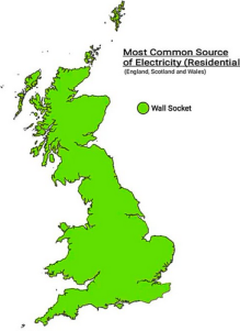
Figure 1:A map showing absolutely nothing. From terriblemaps.
Bad-un
Let’s explore some details of these principles and suggestions using an example. Figure 2 shows many things wrong you can do with a map, from too many colors, excessive text, a hard-to-read legend, and confusing data layers. Overall, it’s just trying to show too many layers and combining data that may or may not be related in a static map. There are random fire labels, some overlapping text, and, unless you know the area, it’s hard to tell where the map is located. The only thing this map gets kudos for is 80’s ski clothing color styling!
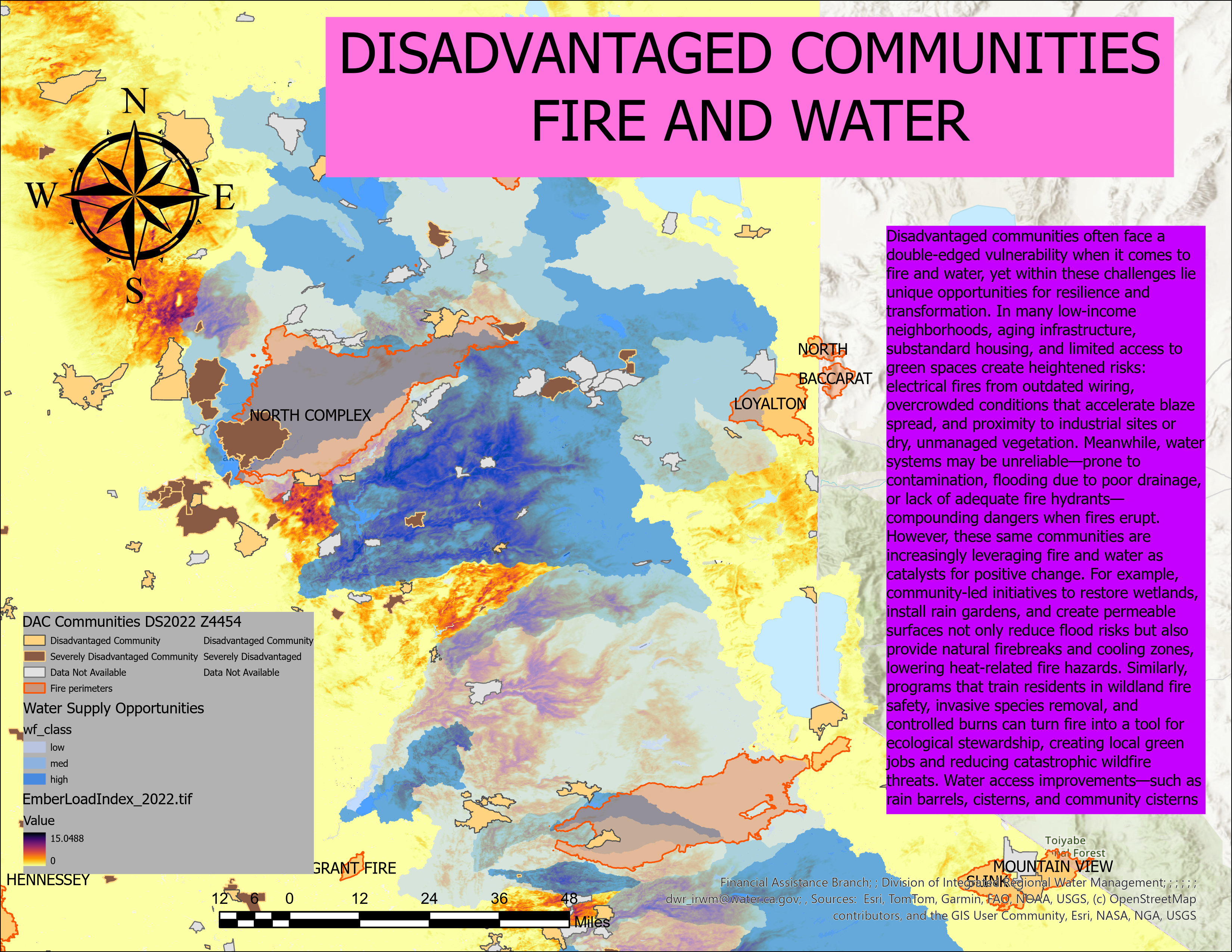
Figure 2:A terrible map!
Good-un
Let’s see if we can simplify it to make it a little more readable. In the new map, we’ve simplified the layout in several ways Figure 3. First, we removed the north arrow, scale bar, much of the purple text, and background colors. We also removed the credits, something we normally would not recommend, but they were quite long, and it was easier to move them to the figure caption. We added an inset map showing the location of the area of interest, highlighted with a clearer border, on a simplified base map. This focuses the reader on the important parts.
We clarified the title as well. Legend entries are simplified and fewer. We used guides to align the legend and inset map, as well as the legend and text, to help balance the overall items in the map. It’s not perfect (yet), but it is much easier to interpret and doesn’t bombard the reader with multiple types of data. For instance, the base map could be cleaned up and the labels added to highlight key places.
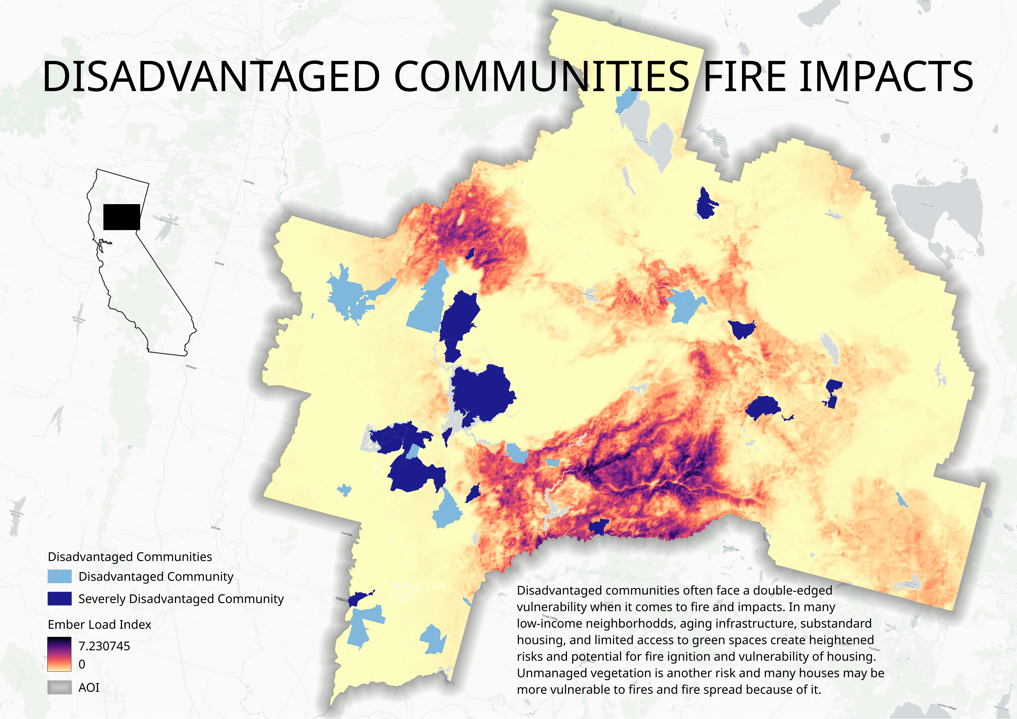
Figure 3:A map of fire impacts on disadvantaged communities. Credits: ESRI, Tiger Lines, USGS, NASA, TomTom, Garmin, OSM, GIS user community.
QGIS AOI
Despite what I said about ArcGIS Pro’s layout being easier to use than QGIS, there is a very useful feature in QGIS that allows you to easily highlight an area of interest on a map: an inverted polygon for a vector layer. In the good map layout example, let’s see how to use this feature (Figure 4).
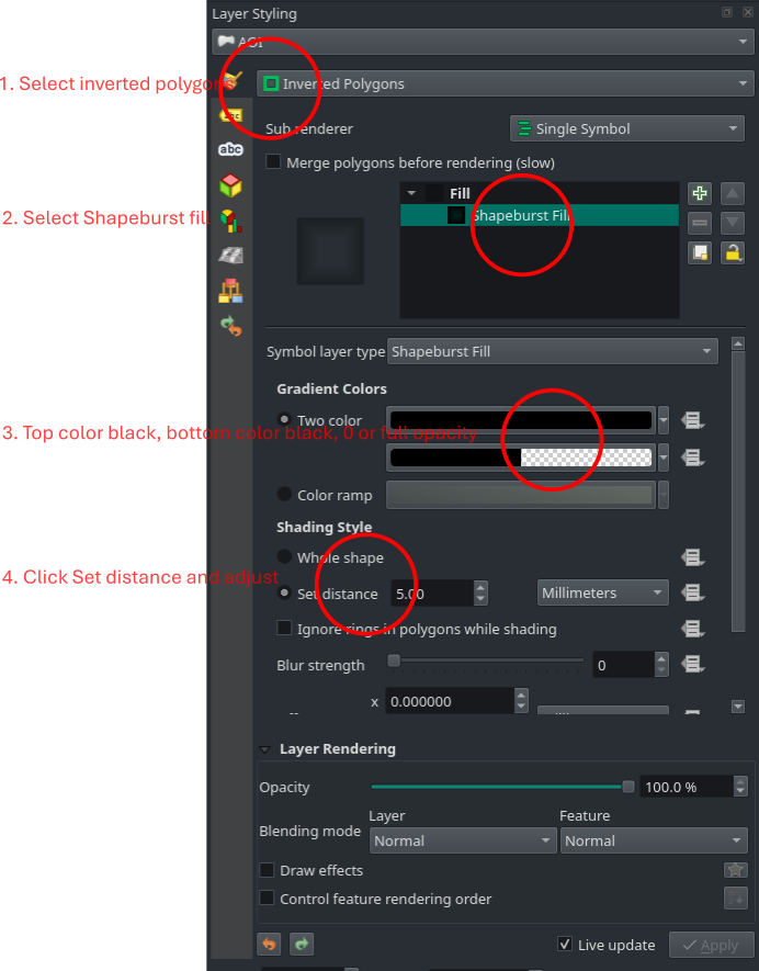
Figure 4:Layer styling effects for an offset gray AOI border.
Here are the steps for gray offset shading for the AOI:
Select inverted polygons in the symbol categorization pull-down menu
Click on Simple Fill below fill and below that in the Symbol layer, type change to Shapeburst fill
In the gradient colors section, change both colors to black with the second black changed to full opacity, e.g., move the opacity slider all the way to the left so that the color is transparent.
Under shading style, click Set distance and leave a 5 mm, or if you want to minimize the shading, reduce or maximize it.
Voila!
The aoi border will now look something similar to Figure 3.
Web
Another option from static maps is creating interactive web maps. QGIS has a basic plugin called qgis2web that creates an HTML version of your map. You can turn the legend on and off and pick the layers and popups from them to feature in the map. Other web-based options include Leafmap, MapLibre, kepler.gl, DeckGL, and Solara, among others.
Map Craft
You don’t have to be the most amazing graphic designer, but practicing your craft, getting your maps out there for feedback, and adapting great designs all help. Whether you’re using FOSS tools or proprietary software, the principles of effective visualization—clear purpose, data integrity, thoughtful encoding, simplicity, and hierarchy—remain constant and guide every design decision you make. By combining these foundational principles with continuous practice and a willingness to learn from both successes and failures, you’ll develop the skills to create compelling visualizations that communicate your spatial data stories with clarity and impact.
ArcGIS Pro layout has several very annoying features that you cannot disable in settings or automate away. One is the default border around any map layout. You then have to go into properties and turn off the border, which is unnecessary and wastes time. The other is the service layer credits that you have to click on dynamic text, search for service layer credits, and then click on the credits to modify them. This automatically reconfigures the box; if you try to adjust it, the text becomes gigantic. Again, there’s no way to disable, automate, or quickly change these annoying features to fit your needs.
- Field, K. (2018). Cartography. Esri Press.
- Nelson, J. (2026). ArcGIS Pro layout makeover. YouTube. https://www.youtube.com/watch?v=q93ZAFoS_bc&t=10s
- Bertin, J. (1967). Sémiologie graphique: Les diagrammes les réseaux, les cartes. Mouton Paris.
- Tufte, E. R., & Graves-Morris, P. R. (1983). The visual display of quantitative information (Vol. 2). Graphics press Cheshire, CT.
- Few, S. (2013). Information dashboard design (2nd ed.). Analytics Press.